Brand Refresh & Packaging Redesign
Holly Willoughby x Dunelm
Refreshing the visual identity and packaging system for Holly Willoughby’s Dunelm-exclusive homeware collection,
creating a more contemporary and cohesive brand direction across bedding and soft furnishings.
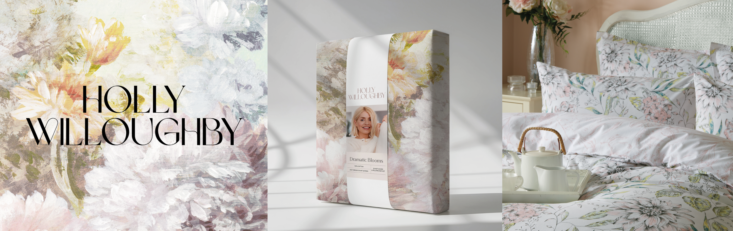
Holly Refresh was a visual rebrand and packaging redesign for Holly Willoughby’s Dunelm-exclusive homeware collection, created to modernise the range and align it with a more contemporary direction. The existing packaging system needed a more cohesive and elevated approach across bedding and soft furnishings, with improved consistency across the wider collection. As the sole graphic designer on the project, I led the process from research and concept development through to final production artwork, creating a refreshed logo, typography system, colour palette, packaging layouts and supporting swing tags.
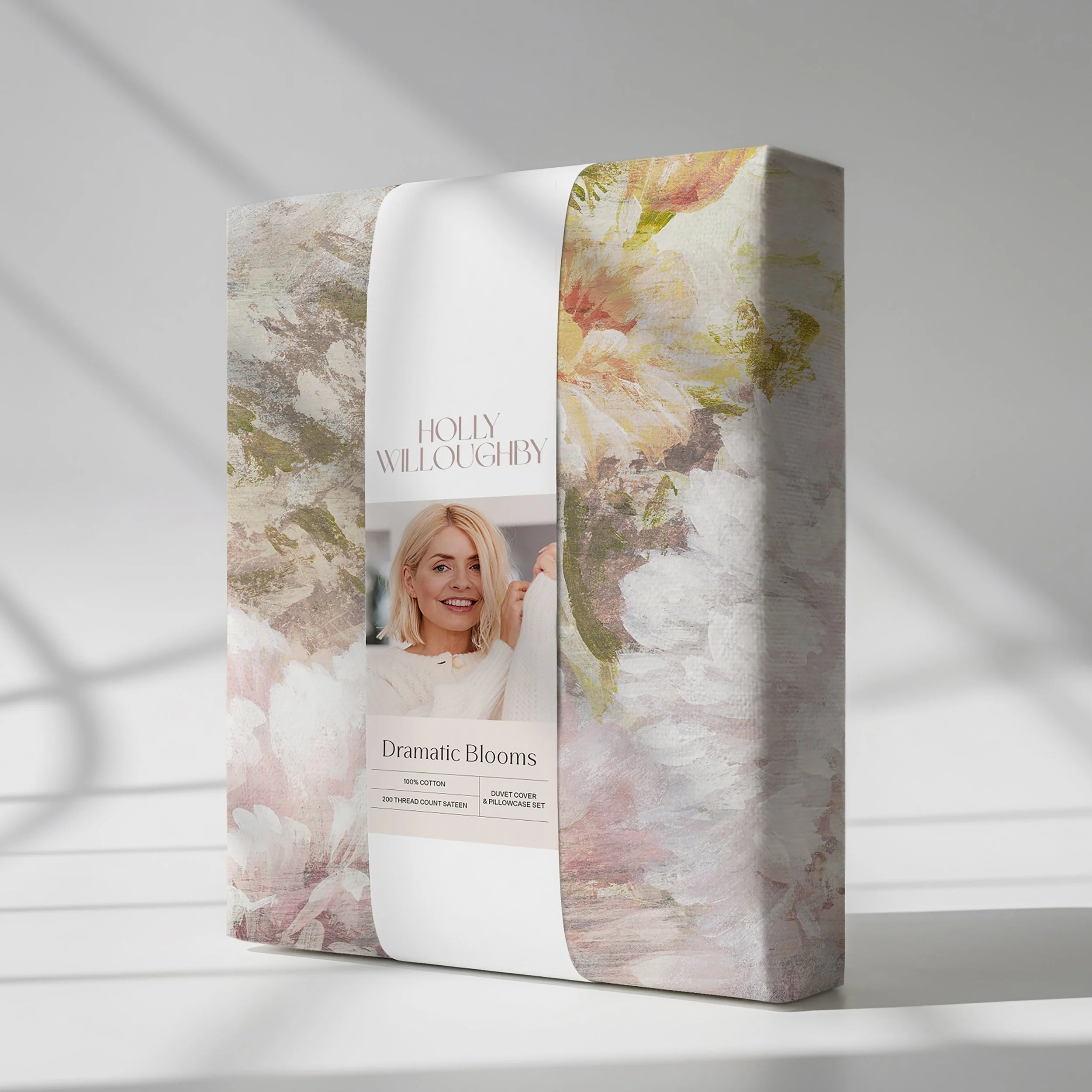
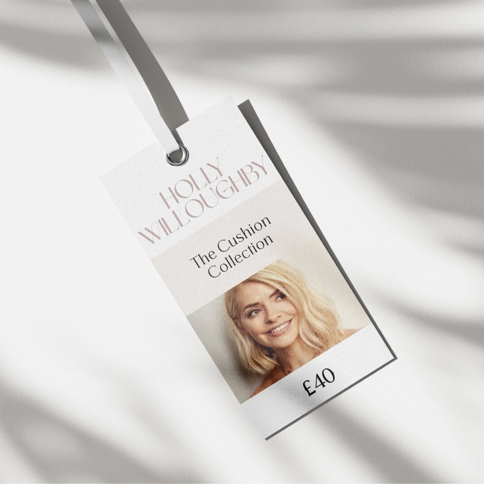
Project Development
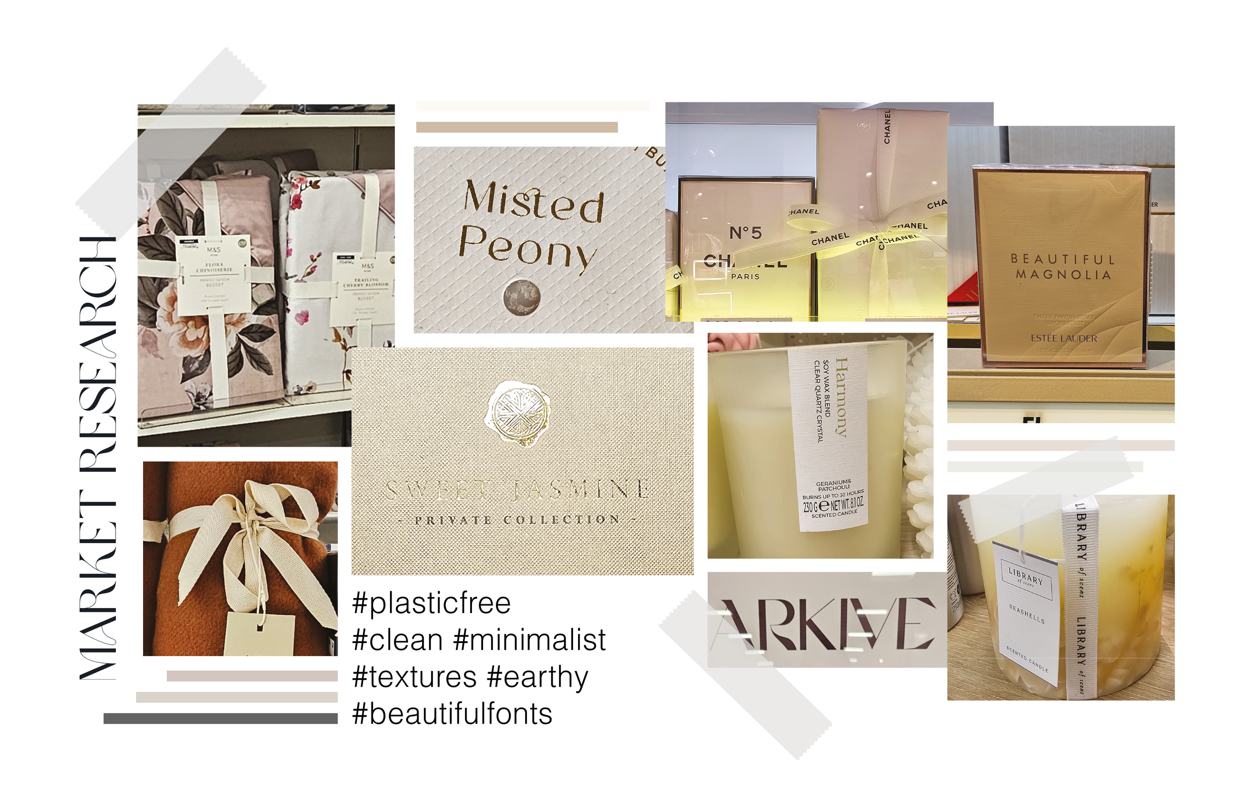
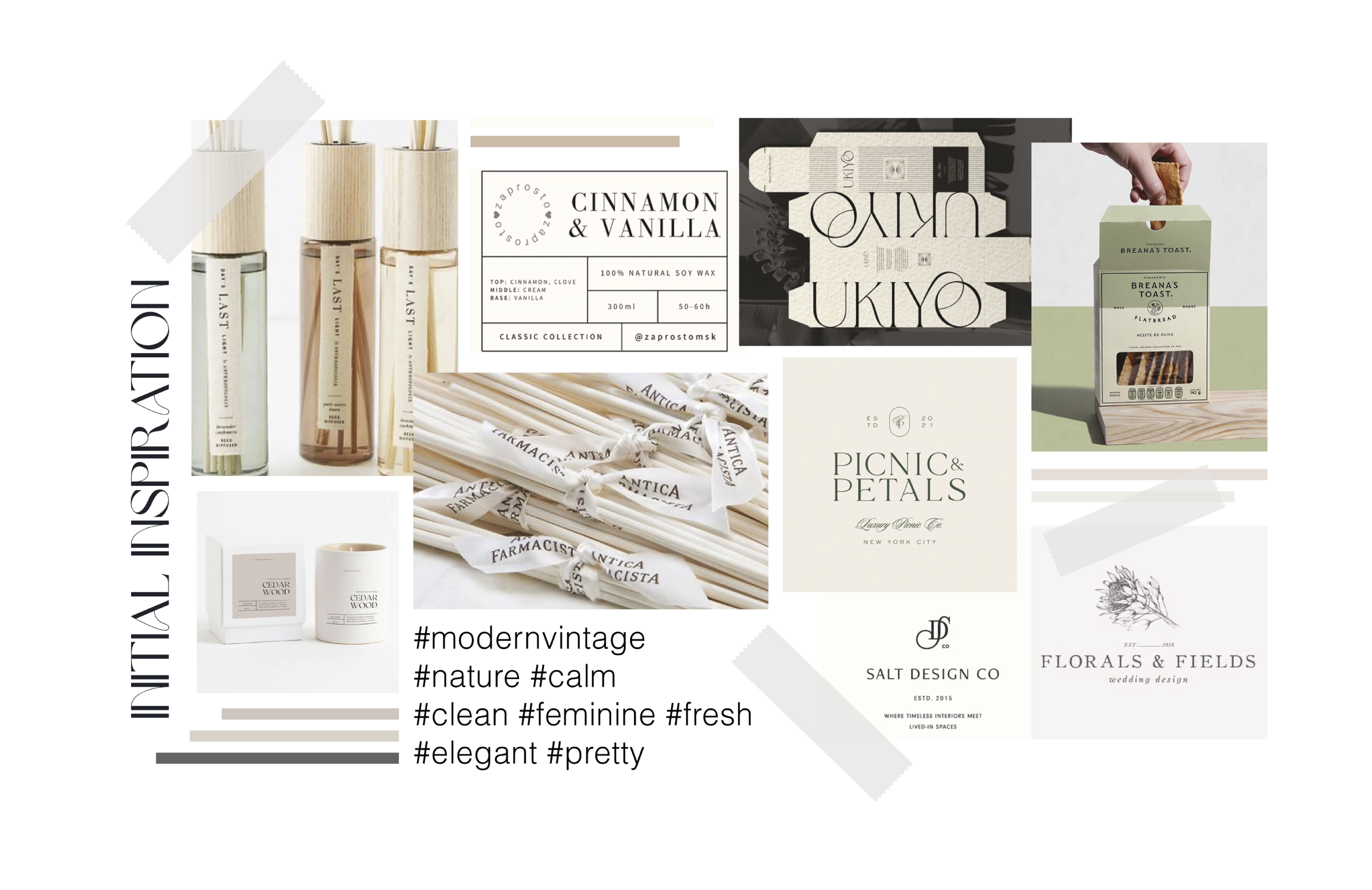
The project began with first-hand packaging research across homeware, beauty and lifestyle retailers, exploring how premium brands used materials, typography and minimal design systems to create stronger shelf presence. These findings informed moodboards and concept development, focusing on a softer, more feminine and contemporary visual direction. I explored multiple packaging routes before refining the final system, ensuring the design complemented the product range while creating a consistent identity across all touchpoints.
Outcome
The refreshed packaging system was approved internally and by Dunelm’s buying team before moving into production and being introduced across the retail collection.